Isaac Freeman
-
My submission on the Treaty Principles Bill
I've submitted the folloiwing to the New Zealand Parliament on the Treaty Principles Bill.
I/We wish to make the following comments #
E rere taku manu ki te tihi o Kahukura. Rere iho taku manu mā te awa o Ōpawaho. Tau ana taky manu ki te whenua o Ōtautahi. Ko Kai Tahu te mana whenua, te iwi whakaruruhau. E noho ana au i te rohe o Te Hapū o Ngāti Wheke.
I am a Pākehā New Zealander. I do not whakapapa Māori, but throughout my life I have been enriched and informed by Te Ao Māori, and I have always understood that relationship to be at the core of this country's culture. Like many others, I wish to express my opposition to a Bill that seeks to legally impose an interpretation of Te Tiriti o Waitangi that is ahistorical, unjust, and alien to my understanding of the values of this country.
The proposed bill aims to define in law three new principles.
The first proposed principle asserts that the the Government of New Zealand has full power to govern. This directly contradicts Article Two of Te Tiriti o Waitangi, which guarantees Māori continued tino rangatiratanga. The idea that the Māori signatories of Te Tiriti, five years after many had signed a declaration of independence in He Whakaputanga o te Rangatiratanga o Nu Tireni, could have intended to cede all sovereignty to the Crown strains credulity. It has been tested repeatedly without success. The Waitangi Tribunal provided a definitive interpretation of the historical evidence in 2014, which affirmed that "rangatira did not cede their sovereignty in February 1840". The bill aims to override this considered legal determination by imparting the force of law to an unjustified and implausible interpretation.
The second proposed principle aims to nullify Te Tiriti o Waitangi by asserting that it has no application except where it has been replaced by legislation, settlements, or other agreements with the Crown. It uses the past tense "had" implying that Māori no longer have the rights they had when they signed Te Tiriti. It is not explained how these rights supposedly evaporated.
The third proposed principle seeks to assert that everyone is equal under the law. This is a classic rhetorical flourish, appealing to high-minded principles to distract from context and history. The contract between Māori and the Crown embodied in Te Tiriti o Waitangi was repeatedly and systematically breached by the Crown at many points in New Zealand's history. In the context of the bill's denial of tino rangatiratanga and any continuing rights of Māori to retain rights that are specifically guaranteed in Te Tiriti, it is hard to interpret the third principle as anything other than an attempt to erase Māori as a meaningful party to Te Tiriti. We are to ignore that our modern nation's founding document was a contract between two parties.
There is a long history of trying to define principles derived from Te Tiriti. Some of these have been made with good intentions, others have been attempts to disregard the meaning and intent of the text and replace it with move conveniently vague ideas. It is better to understand Te Tiriti directly for what it is: a binding contract between the Crown and Māori, providing for continued independent sovereignty of Māori within the British imperial system. That is how it was understood at the time of signing, and it remains the most straightforward and pragmatic way to understand it today.
This bill aims to replace Te Tiriti with arbitrary principles that do not derive from the text.
Further, the proposed principles contradict Te Tiriti.
Further, they have been proposed without any consultation with Māori.
This is clearly not a good-faith attempt to interpret Te Tiriti. It is an attempt to nullify it.
I believe the underlying reason for this attack on the meaning and relevance of Te Tiriti o Waitangi is corruption. Continuing Māori sovereignty according to Te Tiriti requires that iwi and hapū be involved continuously in the management of New Zealand resources. This prevents the enclosure and control of resources by private companies, and I believe that the financial interests of those companies are of more concern to the current government than the sovereignty of any New Zealanders, Māori, Pākehā, or other tauiwi. This belief has been bolstered by the lack of any significant consultation with Māori prior to introducing the bill.
I/We wish to make the following recommendations #
I recommend that the bill be withdrawn.
I further recommend that interpretation Te Tiriti's application to legislation remain the domain of the Courts, as it would be for any other treaty. There is a considerable body of well-tested legal precedent, and it is considerably better informed by relevant expertise.
-
Kakano at 50
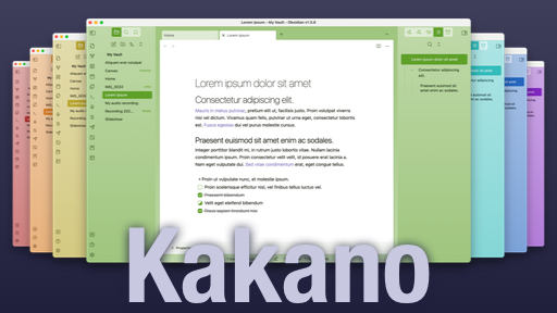
Obsidian inclues a modal where users can browse themes contributed by the community, with a download count for each theme. My own theme Kakano is in there, so out of general curiosity (and definitely not vanity) I've been keeping a record of how many downloads it gets each day, and how that compares with other themes. As of today there are 246 themes, and Kakano has been downloaded more than 123 of them, so I've made it to the 50th percentile.
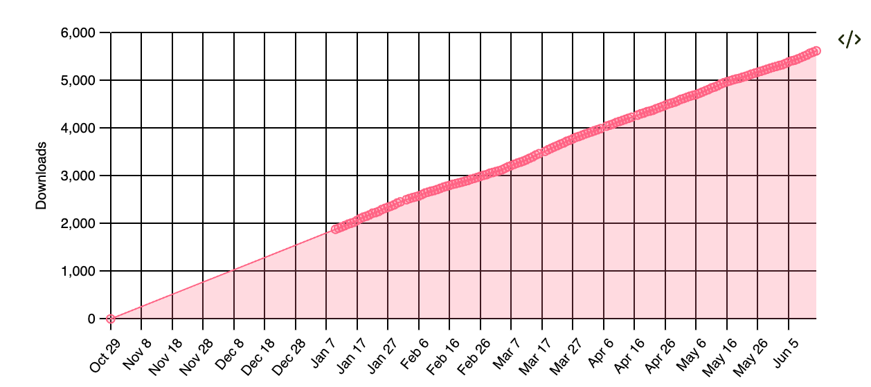
Line go up Kakano has come a long way since I started. It works better on mobile and Windows, and supports almost all of the core Obsidian plugins plus a few of the most common community plugins. A few people have requested features, and I'done my best to judiciously support what they need without making Kakano more complex than it needs to be. There are plenty of Obsidian themes that allow users to customise everything, which is great, but I'm deliberately taking a different approach. I want Kakano to look and feel good out of the box, with a lot of design consistency, and for it to be difficult to accidentally make it ugly.
I'd never go back to working for myself, but I do sometimes miss being able to make decisions without negotiating. I like to think holistically about design, branding, and marketing as well as code, but at work those are different jobs for different people. It's nice to have a hobby project where I call all the shots, and hopefully it keeps me appreciating all the work that my colleagues do when I try to do similar thing sfor myself.
Kakano is basically one big stylesheet with over 6000 lines. I could split it up into smaller files, but I like having no build step between editing in a browser and seeing the results in my local Obsidian vault. I don't need to target old browsers, just the current version of Blink that Obsidian uses for layout, so I get to use new CSS features as they arrive. Modern CSS is amazingly powerful.
I have a big list of things I want to improve in Kakano, and I'm still making small improvements several times a week. I shall keep going as long as I feel like it.
-
Sustainable Dev Environments with Docker and Bash
Docker is a good tool for deployment, but I've always found it too fiddly to be useful for development environments on macOS.
David Bryant Copeland's Sustainable Dev Environments with Docker and Bash covers a straightforward way to fix that, walking through how to write Bash scripts to manage Docker containers for development. Along the way it provides a refresher course on Docker and Bash scripting, and shows how to build well-behaved scripts with all the behaviour you'd expect from a command-line tool.
Both Docker and Bash have (to put it mildly) a lot of poorly-conceived terminology and unpredictable behaviour. They're messy, but they're widely used, and Bash especially has stood the test of time. Copeland is appealingly snarky, and doesn't try to hide the sharp edges: instead he shows how to build around them so you don't get cut. It's immensely reassuring as a reader to know that the author sees the same problems you do, and has mapped out a path to avoid them.
4 more posts can be found in the archive.