Isaac Freeman
Tagged “obsidian”
-
Kakano at 50
Obsidian inclues a modal where users can browse themes contributed by the community, with a download count for each theme. My own theme Kakano is in there, so out of general curiosity (and definitely not vanity) I've been keeping a record of how many downloads it gets each day, and how that compares with other themes. As of today there are 246 themes, and Kakano has been downloaded more than 123 of them, so I've made it to the 50th percentile.
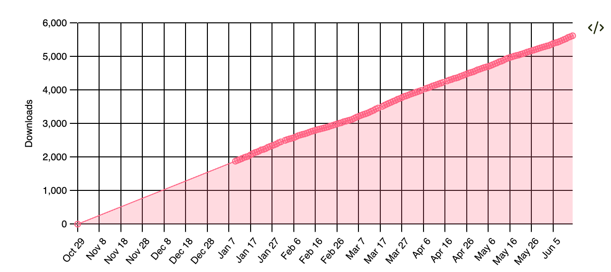
Line go up Kakano has come a long way since I started. It works better on mobile and Windows, and supports almost all of the core Obsidian plugins plus a few of the most common community plugins. A few people have requested features, and I'done my best to judiciously support what they need without making Kakano more complex than it needs to be. There are plenty of Obsidian themes that allow users to customise everything, which is great, but I'm deliberately taking a different approach. I want Kakano to look and feel good out of the box, with a lot of design consistency, and for it to be difficult to accidentally make it ugly.
I'd never go back to working for myself, but I do sometimes miss being able to make decisions without negotiating. I like to think holistically about design, branding, and marketing as well as code, but at work those are different jobs for different people. It's nice to have a hobby project where I call all the shots, and hopefully it keeps me appreciating all the work that my colleagues do when I try to do similar thing sfor myself.
Kakano is basically one big stylesheet with over 6000 lines. I could split it up into smaller files, but I like having no build step between editing in a browser and seeing the results in my local Obsidian vault. I don't need to target old browsers, just the current version of Blink that Obsidian uses for layout, so I get to use new CSS features as they arrive. Modern CSS is amazingly powerful.
I have a big list of things I want to improve in Kakano, and I'm still making small improvements several times a week. I shall keep going as long as I feel like it.
-
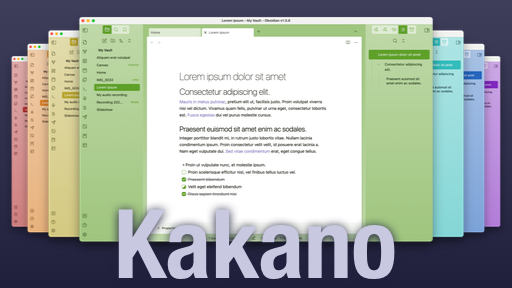
Kakano theme for Obsidian
Obsidian is a note-taking app I use a lot. It's extremely versatile, and great for storing all sorts of information that you want to get out of your head. You can link notes together into a kind of personal wiki, and there's a busy community building plugins for it. Notes are stored in standard Markdown, and grouped in "vaults".
I use Obsidian for work, where I keep a daily logbook of what I'm working on, agenda items for upcoming meetings, and snippets of code to remind myself how to do various things. But I also keep a separate Obsidian vault for personal stuff: projects, shopping lists, draft submissions for for legislation, ideas for stories and non-fiction articles, and whatever else.
Colour #
I switch between these two vaults a lot, so I wanted to be able to tell them apart at a glance by having a strong colour difference. There are lots of themes available, but most seem to be designed with the (very reasonable) assumption that people typically use one vault at a time. But Obsidian is built with web technologies, and I am a web developer, so I made a new theme for the job.
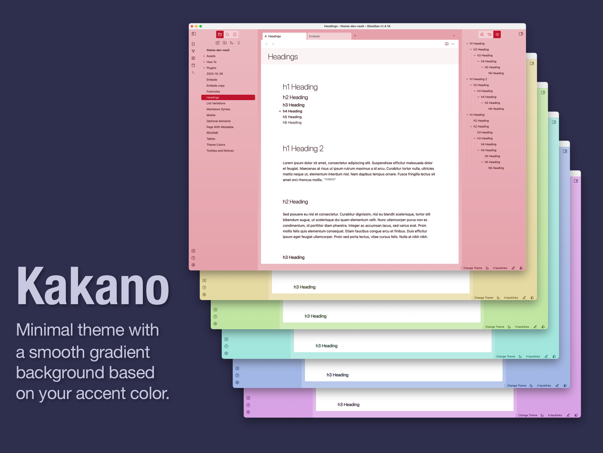
Obsidian provides a setting for an accent color, which by default is used for links, controls and text selection. That accent colour is available to themes, so I set out to use it more extensively. Kakano generates a set of lighter and darker shades from that base colour and uses them to provide a subtle smooth gradient background, and matching modal windows and controls.
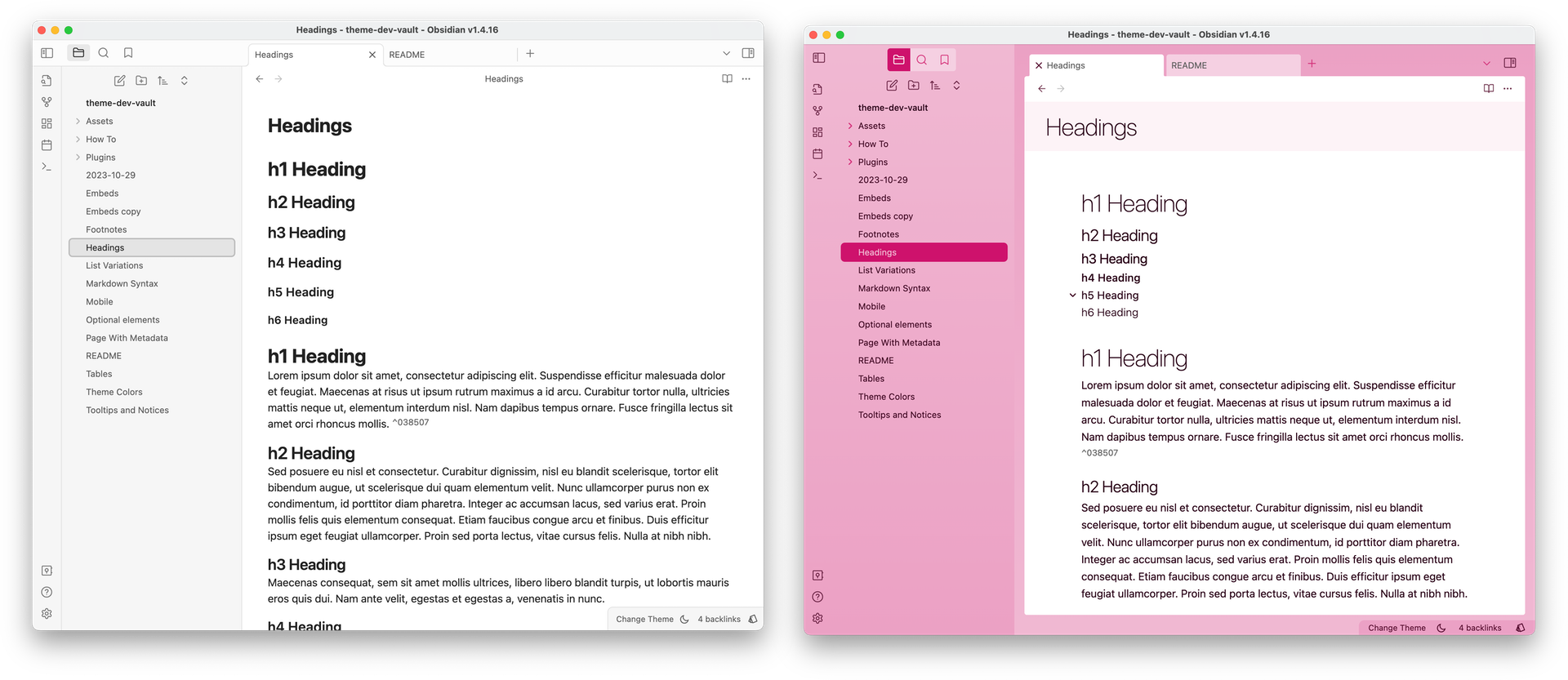
Default Obsidian theme on the left, Kakano on right. I use purple for work, green for my personal vault. The bright colours make it easy to locate my vaults against the mostly-monochrome windows of other apps.
Kakano is the Māori word for "colour".
Additional features #
Light/dark themes #
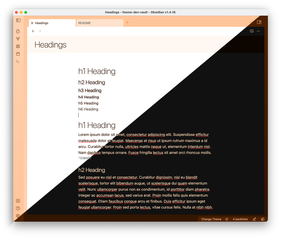
Obsidian supports light and dark modes, so Kakano does too.
Close buttons where they belong #
Obsidian is available for Windows, macOS, Linux, iOS and Android. On most of these platforms the control to close a window is positioned on the right, so that's where it appears in most Obsidian themes. On macOS, though, close buttons have always been on the left of windows. I guess most people aren't bothered by the inconsistency, but I am not one of those people: when a macOS app has close buttons on the right it stands out like a sore thumb. Kakano detects which platform it's running on, and moves close buttons to the left if it's running on macOS.
Consistent controls #
Obsidian provides a lot of controls throughout its UI, and they're often provided by different plugins with slightly different appearances. I've aimed to improve consistency with Kakano.
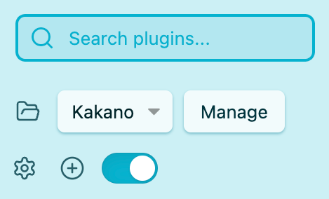
Various Obsidian controls, styled with Kakano Getting Kakano #
Kakano is available to install from within Obsidian. Go to
Settings > Appearance, then click onManagein the Themes section. You'll find it listed there alongisde other community themes that have been approved by the Obsidian team.Source code is available on Github.
Future #
There's a lot more to do! In particular, I want to polish how Kakano appears on mobile screens, and how it renders notes that use popular Obsidian plugins.
See all tags.